Boost
Engagement
with Fresh
Touchpoints
Originally conceived as a class project, my brand audit and redesign initiative for Lou Malnati's pizzeria evolved into a personal endeavor driven by the opportunity unearthed during extensive research. Focused on revitalizing public interest in this iconic family-style restaurant, the project aims to enhance Lou Malnati's timeless appeal while modernizing its brand image. Through meticulous analysis and strategic insights, the redesign endeavors to preserve the restaurant's cherished traditions while introducing innovative elements to attract a broader demographic. By leveraging a blend of authenticity and contemporary design principles, the goal is to reaffirm Lou Malnati's position as a beloved culinary institution, catering to both loyal patrons and new generations of diners seeking memorable dining experiences.
Graphic Design
Branding
May-June
(2 months)
Camron Hinkle
Class Project-
Sandra
Kumorowski
Overview
003
I refreshed their Style Guide and developed potential new advertisements. These leverage the brand's heritage and recenter the focus on family first.
End Result
004
Over a semester, I studied luxury branding practices and applied them to accessible brands. For our final project, we conducted an in-depth brand audit and proposed improvements. I then continued the project independently, developing the proposed touchpoints.
01.
Deep-Dishing out a New Look
Independent pizzerias excel in quality, and larger chains dominate fast delivery. Our rebrand of Lou Malnati's focuses on celebrating the joy of sharing handmade pizza with family.

02.
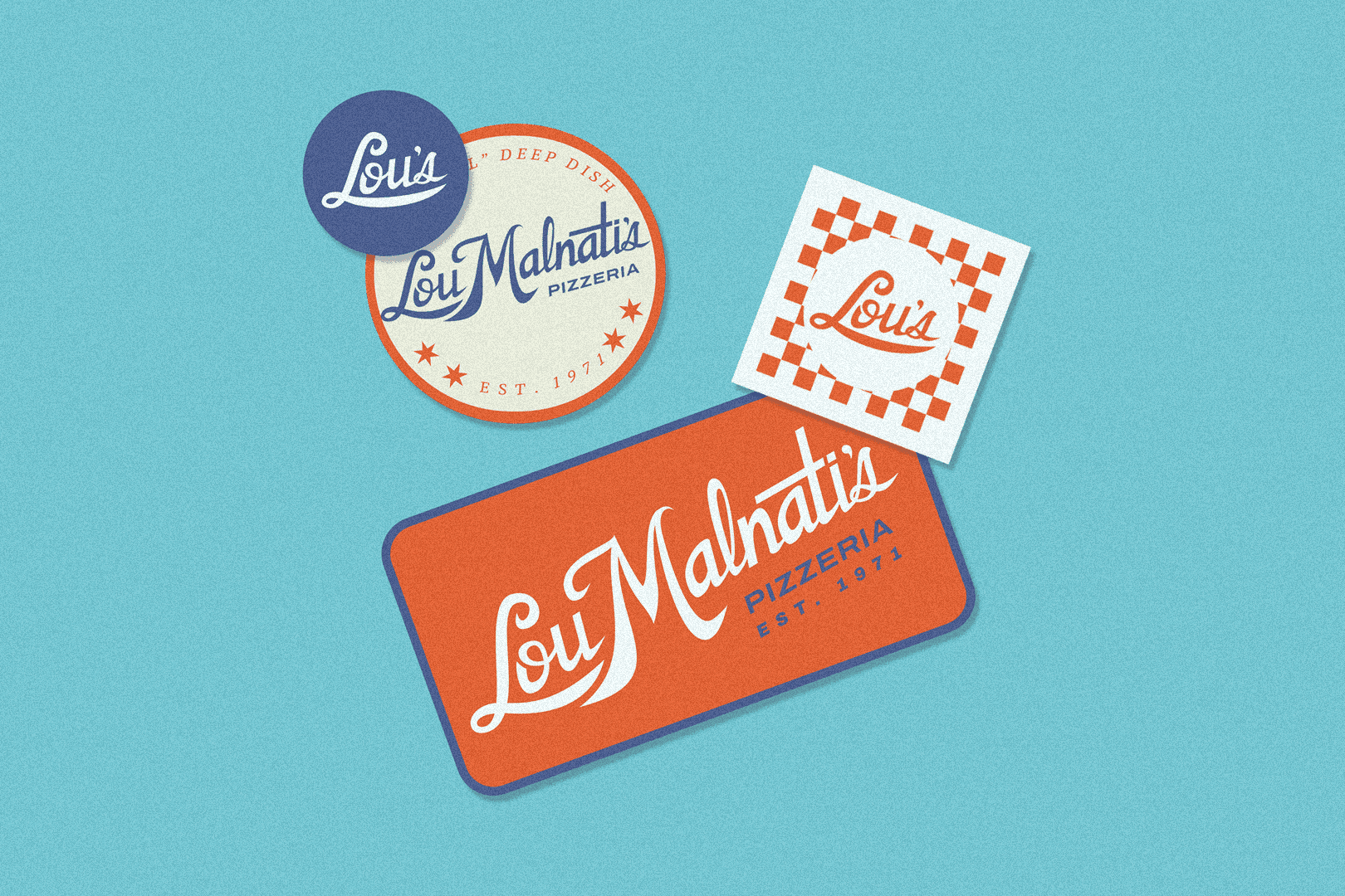
Saucing up the Ads
These minimal designs highlight new touchpoints that emphasize Lou Malnati's Chicago roots and luxury practices, including celebrity influencers, sustainable packaging, and interactive experiences
Insights
005
For the original assignment, I conducted a brand audit, exploring the company's history, brand consistency, social media presence, current touchpoints, SWOT analysis, competitive analysis, and branding map. Here are some of the findings.
Lou's was founded as a family-friendly restaurant but has become seen as just another takeout option. This is an opportunity to revive family sit-down meals, emphasizing the dining experience and quality ingredients. Lou Malnati's can strengthen customer loyalty and reclaim its reputation as a cherished family gathering place by fostering a warm, inclusive environment and celebrating family moments.
Lou was a pioneer of Chicago-style deep-dish pizza even influencing other Chicago staples like Portillo's, Lollapalooza, and the Taste of Chicago. But these roles and their community contributions can seem too corporate causing them be overlooked. By emphasizing their deep roots and genuine local partnerships, Lou Malnati's can reinvigorate their connection with the city's heritage and resonate more with locals, even after their sale to the Meritage Group
Lou Malnati's has maintained consistency for over 50 years, which has boosted brand recognition but also led to a stale perception and low engagement. Despite a large social media following—over 105k on Instagram and 173k on Facebook—their posts average only 203 and 141 likes, respectively(less than .001%). Through incorporating luxury branding practices we can refresh the brand and increase engagement.
006
Inspired by the elegance of luxury design practices and the bold symbolism of the Chicago flag, the new logo honors our roots while stepping confidently into the future. I attempted to preserve the heritage and recognition of the original hand-drawn logo.

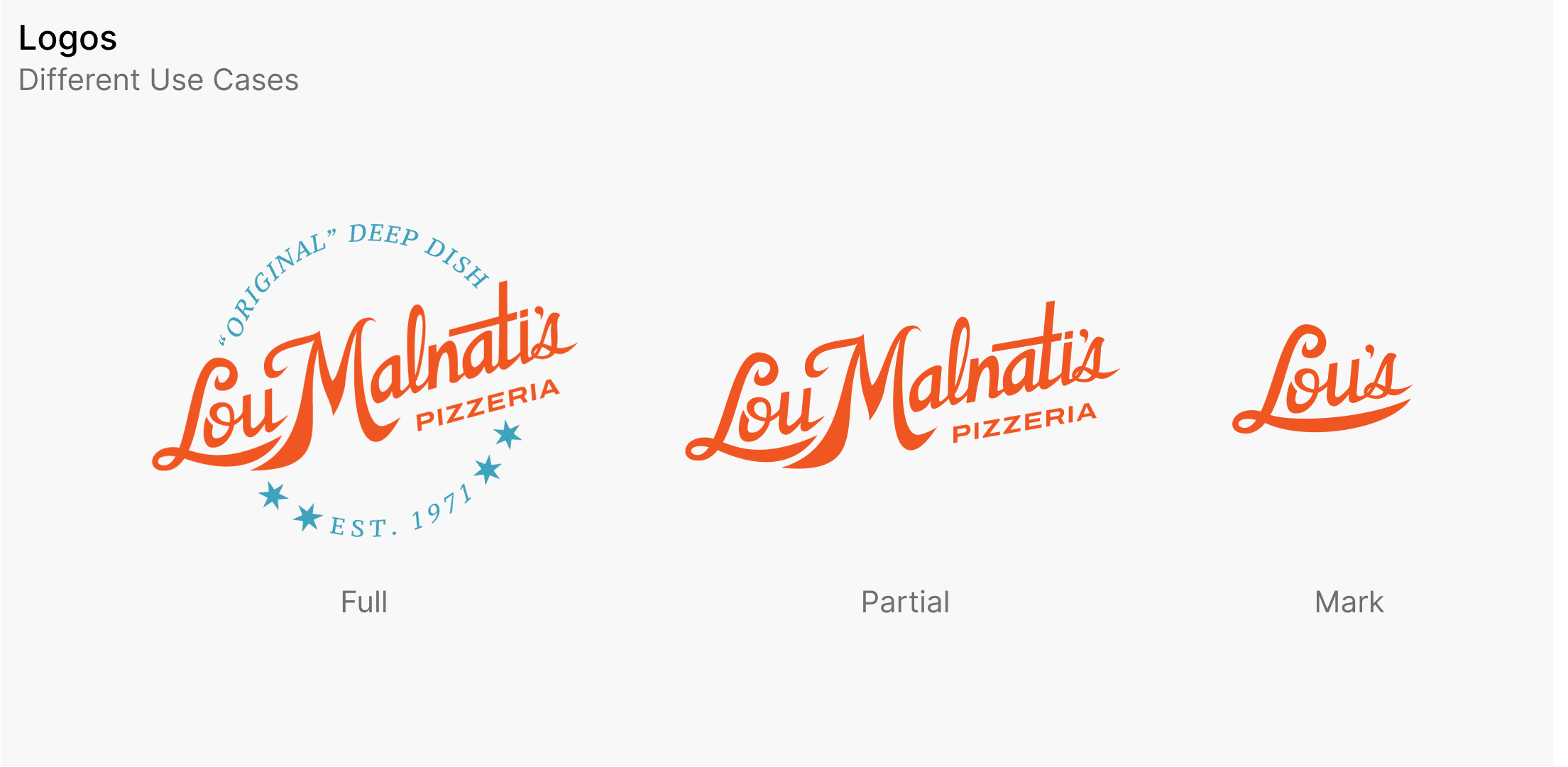
Branding
007
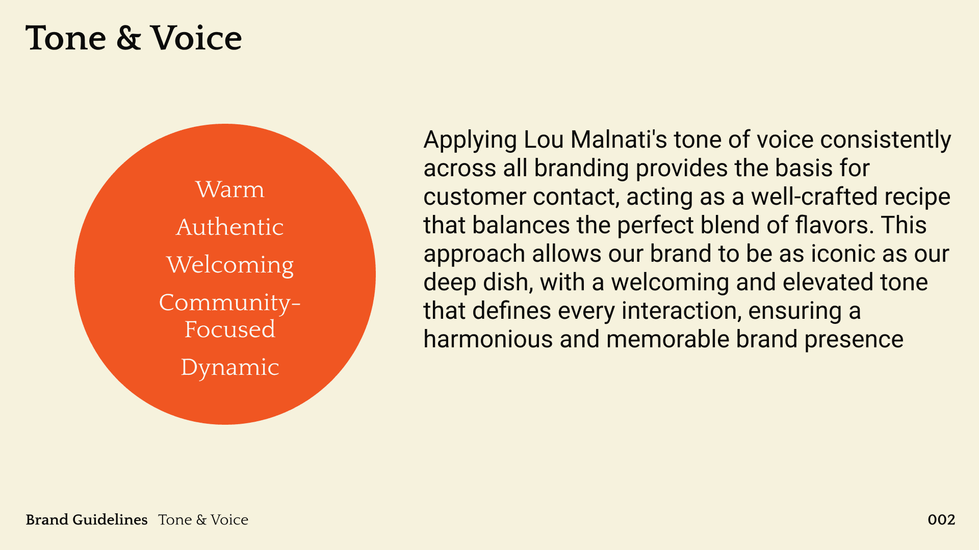
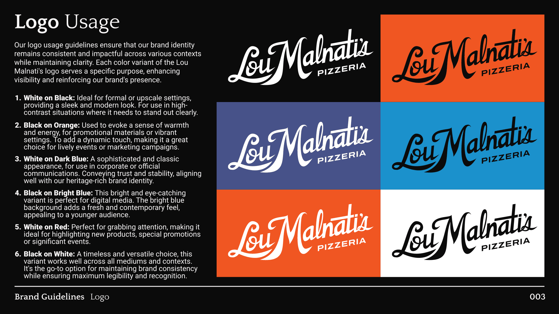
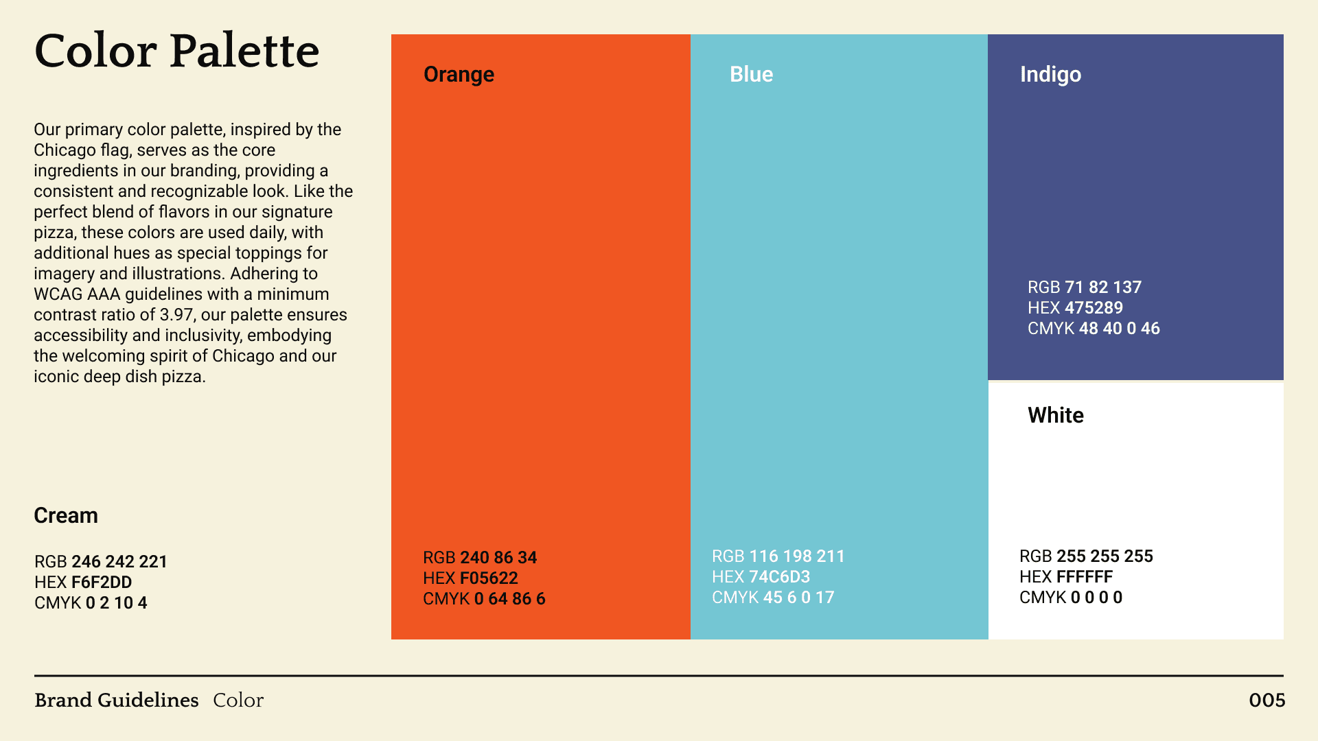
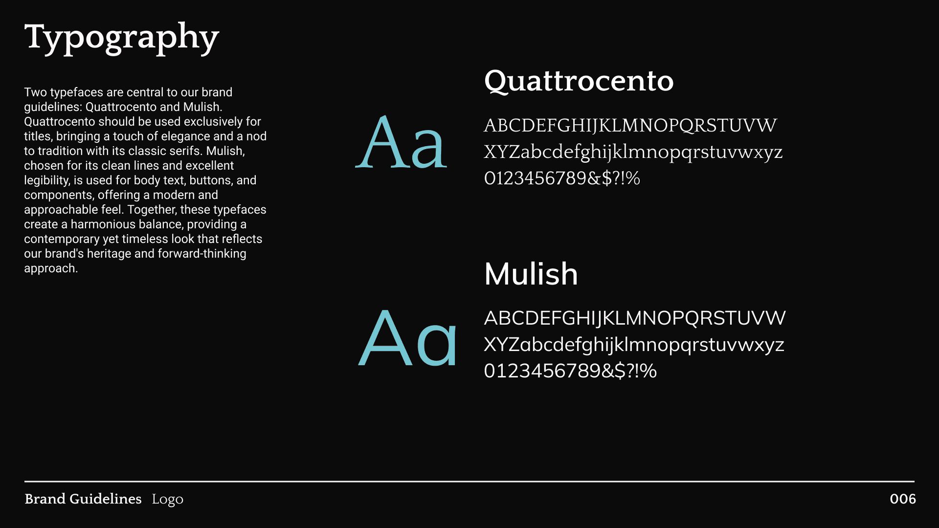
To support the overall design, I've created a brand guideline kit. Including tone of voice, logo usage, colors, and typography. Crafted to ensure a cohesive and recognizable brand identity.

Final Designs
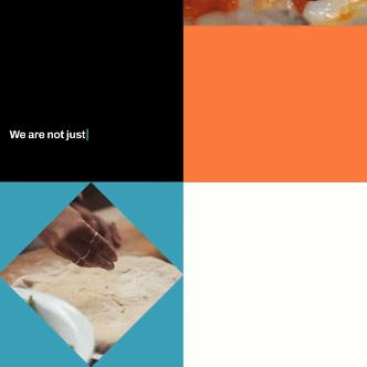
008
Putting everything together, I created several new touchpoints to captivate different audiences. While I was not able to conduct any user testing, but I would like to track social media engagement, as well as their mentions and website traffic.
01.
Bus Stops
The focus is on capturing the attention of commuters and passersby with bold, eye-catching visuals and concise messaging.


02.
Social Media
The new online presence will utilize fast-paced, interactive platforms to reengage the audience and provide a sense of agency. It will transition from outdated to outstanding, leveraging the brand's rich heritage.
03.
Train Stations
Here we aim to engage a diverse and busy audience with visually striking designs and clear, inviting messages. Whether they're headed into the city or returning home we want to be a part of their day.

Takeaways & Outcomes
Feedback
“Great research, analysis, and insights! Implementing the rebrand went above and beyond expectations.”- Sandra Kumoroski, Professor
“The rebrand is very clear and clean! You get your message out efficiently and highlight important information, which makes understanding the problems and solutions very easy. ”-Rachel Manlubatan, Peer
Learnings
This project has been a rewarding journey, especially with the hands-on elements like hand lettering and branding details that I thoroughly enjoyed. Working without strict guidelines or a set schedule posed challenges but ultimately improved my motivation and documentation skills, helping me maintain project consistency over time. While I aimed to streamline the case study, this led to a more linear presentation than the actual process, revealing areas where I could have included more depth. Additionally, limited feedback led me to design based on personal preferences and confirmation bias rather than user needs. Moving forward, I plan to focus more on data-driven research and user feedback to enhance my designs and avoid these pitfalls. Although I’m just beginning my journey, this experience has been instrumental in shaping my approach and highlighting areas for growth.