
Role
UX Research
UI Design
Team
Camron Hinkle
Time
Oct-Dec 2023
(2 Months)
Clients
Class Project-
Jo-Nell Sieren
Overview
Customers want to buy games but the process of buying and navigating the large selection is confusing, cumbersome, and distracting.
User research led to the goal of simplifying the experience with consistent navigation, clear content structure, and an accessible color palette.
Initial Research

01.

02.
Define
The first few weeks were spent combing through the current documents and exploring the different stakeholders. This discovery period helped to fully understand the site structure and its position within the market, and its current audience.

Conducted 3 user interviews and an audience analysis to identify pain points. Through this, I learned how to avoid any leading questions and merely observe their interaction. This data was synthesized and ranked in Sheets. Here are the main findings:
01.
Multiple users were frustrated by the small and complex menus. If users can’t find what they want they won't buy anything. Along with improving the use of Task-focused terminology combined with Iconography.
02.
Uses often settle for games pushed at them as the best match is often lost in a sea of noise. One user was looking for the multiplayer filter and gave up deciding to look through the "free to play" manually instead.
03.
When the site looks more appealing users will be willing to spend more time and money on games. A brand new user even said ït hurts my head" as soon as they started scrolling on the homepage.


Design
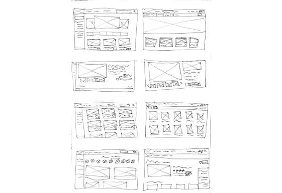
Crazt 8's
Here I rapidly sketched eight different wireframe concepts. Each sketch aimed to address and prioritize key issues identified from ranked findings during user interviews. By focusing on resolving as many user pain points as possible, this exercise allowed me to explore a wide range of design solutions and gather diverse ideas for the final design.

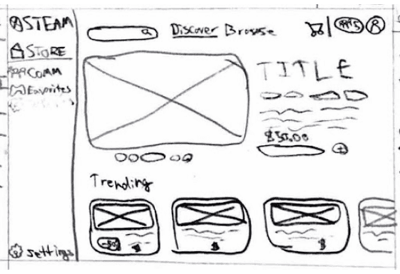
Rapid Sketch
I then had to transition the strongest of the 8 from a rough 1-minute sketch to a more clearly defined low-fidelity wireframe. By refining the initial ideas, I created a structured layout that began to take shape, allowing for better visualization and evaluation of the core design elements before proceeding to higher-fidelity iterations. Such as the lack of important text and intrusive present friends sidebar.
Rapid Sketch Ideation
The ideation and refinement process of the chosen design. It proved challenging to strike a balance between existing terminology and more task-focused language for new users. Additionally, It was surprising to grapple with the numerous complex systems buried deep within the site, such as profile XP and the Community Market, while some took thoughtful integration others would be more beneficial as a separate stand-alone site.

Paper Prototype
I then developed a comprehensive paper prototype from the refined wireframe. By mapping out user pathways, I was able to conduct peer evaluations to gather feedback. Although the interactive digital representation above was intended to be helpful, it ultimately introduced more issues in the user experience than it solved, making it a less effective use of time compared to the hands-on paper prototyping that it was constructed from.
Initial Research
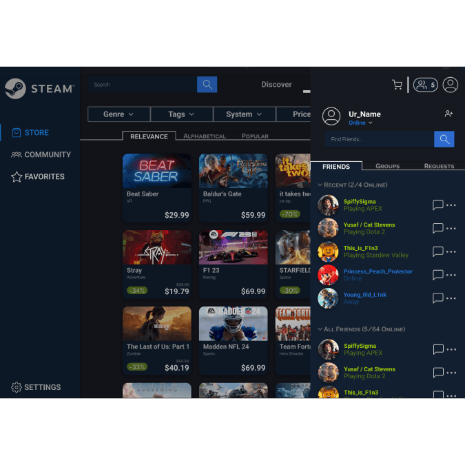
The existing branding effectively created a classic modern look but in practice it was muddy and inaccessible. My goal was to revamp it to be sleek and minimal. Color should be used strategically to reinforce visual hierarchy rather than competing for attention. Not pictured here but much of the prototyping time was spent building atomic components to ensure consistency across the site.

Final Prototype
Impact & Takeaways
“This project was a standout- Great work! You have a thoughtful approach and a well-documented process. You have a bright future as a UI designer!”- Jo-Nell Sieren, Client
“Really nice UI choice and good flow for community tabs”-Jo-Nell Sieren, Client
“Much More Accessible and organized. I feel like I can actually navigate and understand what I’m looking at now.” - Erin Conroy, User
Before this project, I had no knowledge of Figma. In roughly three weeks, I taught myself how to use the program, along with many foundational skills from the atomic design method for components to formatting saved colors/fonts for developers. Furthermore, this class allowed me to complete a full project from conception to working prototype. I learned to write effective interview scripts, analyze user data, and conduct unmoderated usability testing. Ultimately, it was not completing each of these skills that was my biggest takeaway but rather learning how and when to utilize them to inform the design.
Looking back I would have done each piece a little differently such as the user personas have a lot of information that is not actionable. A deliverable is only beneficial if it facilitates conversation and can be referenced to inform decisions quickly. Additionally, while I did utilize a grid system for the design it is not responsive. This was a process of learning where each piece was figuring out the motions but doing so free of assignment criteria would reduce validation bias and allow for a more organic path.